
Introduction
The biggest branding mistake small businesses make is assuming design is a cosmetic choice.
They say things like:
“I’ll make a logo in Canva.”
“My nephew knows Photoshop.”
They assume branding is a cheap task instead of a strategic investment.
Human brains process visuals faster than text—tens of thousands of times faster. Before customers read your copy, before they see your pricing, before they hear your pitch, their minds have already made a judgment.
Design isn’t art.
Design is communication.
Design governs perception.
Brand visuals act long before your sales team does. Design sets expectations about credibility, quality, price positioning, and risk. Companies don’t lose trust because their logo is bad; they lose trust because their visual identity contradicts the value they claim to sell.
The Trust Filter (The Bank Analogy)
Consider a simple analogy:
Would you deposit your life savings into a bank with a cardboard sign hung by tape and peeling paint?
No rational person would.
Because trust isn’t built on statements; it’s built on signals.
Your website, logo, business card, and social presence form the first trust filter.
Pixelated icons, mismatched colors, inconsistent typography, and template visuals make your business feel unstable. Customers won’t articulate why—they don’t consciously analyze fonts or kerning—but their subconscious places you in the “risky” category.
This is the core business graphic design impact:
Visual authority influences buying decisions even before logic enters the discussion.
When your design looks amateur, your pricing feels inflated.
When your design looks refined, your pricing feels justified.
That’s not opinion. That’s consumer psychology.
Branding acts as your credit score.
Poor design = high perceived risk.
Exceptional design = reduced friction and increased confidence.
Consistency = Memory = Sales
Large corporations are obsessive about consistency.
Not because they’re perfectionists, but because they understand repetition creates recognition. Recognition creates memory. Memory creates trust. Trust drives sales.
Coca‑Cola doesn’t change colors on a whim.
Apple doesn’t use five fonts on a product page.
Small businesses often dilute their identity:
Blue headings on Instagram.
Green on the website.
Orange on business cards.
This fragmentation confuses the consumer’s memory.
If your brand feels inconsistent, the brain struggles to categorize you.
Confusion kills momentum.
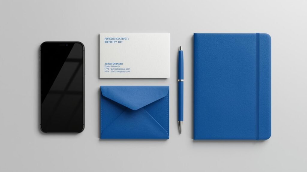
A professional Brand Style Guide solves this problem.
Color palettes.
Typography pairings.
Logo usage.
White‑space rules.
Not because design elitists demand it, but because it positions you as larger, more credible, and more cohesive than your competitors.
Consistency isn’t cute.
Consistency is profitable.
UX/UI: Design Directs the Eye
Graphic design is not decoration.
It is direction.
The human eye follows contrast, size, motion, and spacing. When design is intentional, users see the right message at the right moment. When it’s accidental, they drown in information.
Visual hierarchy determines what gets noticed:
- Product benefits
- CTA buttons
- Testimonials
- Pricing
Good design reduces cognitive load.
Bad design increases it.
When users feel overwhelmed, they leave.
When users feel guided, they buy.
This is why UX designers obsess over spacing.
This is why UI designers obsess over typography weight.
This is why product designers obsess over button placement.
Because every pixel has a job:
to move the user toward conversion.
Disruption: Stock Photos vs. Custom Assets
Let’s address the elephant in the room.
Most generic business websites look identical.
The smiling handshake.
The high‑fiving suits.
The corporate group pointing at a laptop.
Stock photos are visual wallpaper. Users scroll past them because they’ve seen them hundreds of times.
Custom illustrations, infographics, and branded photography disrupt pattern recognition. They force attention. They imply intention.
Effort signals quality.
Quality signals value.
Value supports higher pricing.
A custom logo communicates ownership.
A template communicates compromise.
Cheap design isn’t just forgettable.
It suggests weak margins, low standards, and low commitment.
The Psychological Impact: Price Positioning
Design controls the perceived value of your offering.
Luxury brands use:
- minimal layouts
- muted tones
- refined typography
Budget brands use:
- loud color palettes
- crowded layouts
- badge‑style icons
This is not random.
This is profit engineering.
A luxury handbag and a budget handbag might cost similar to produce, yet one demands a 1000% markup.
Design frames the narrative:
- premium
- mid‑market
- bargain
Your brand visuals determine where you land.
Before the price tag is read.
Design as an Investment, Not an Expense
Design that elevates positioning is not a cost.
It is a multiplier.
Strong branding:
- increases conversion rates
- reduces customer acquisition cost
- improves retention
- justifies premium pricing
- boosts perceived authority
Weak branding drains revenue silently:
- lower trust
- more objections
- higher churn
- lower referrals
Every inconsistent banner, every pixelated logo, every mismatched font weakens your brand equity.
Design is the clothes your business wears to the meeting.
A sharp suit outsells a wrinkled shirt.
Every time.
Why Businesses Resist Professional Design
Three reasons:
They misunderstand design’s purpose.
They think design is artistic expression rather than commercial persuasion.
They underestimate consumer judgment.
Customers judge competence visually, not logically.
They fear cost.
But ignore that poor design costs more in lost revenue than professional design costs to implement.
Branding returns value over time.
Poor design leaks value immediately.
When Good Design Becomes a Sales Asset
Design becomes a true salesman when:
- messaging aligns with visuals
- visuals align with pricing
- pricing aligns with positioning
At that point, branding stops being decoration.
It becomes conversion.
It stops being expense.
It becomes infrastructure.
Final Word
Companies that treat design as an afterthought suffer silent losses.
They lose trust.
They lose attention.
They lose authority.
They lose sales.
Your visual identity speaks long before you do.
If it whispers “Amateur,” the conversation ends.
If it projects “Authority,” you win the sale before you pitch.
Don’t let the wrong visuals sabotage the right business.
Contact Code Nest for a branding audit that reinforces trust, signals quality, and supports revenue growth.
Leave a Reply